Problem: The founders of Synq need an eye-catching and distinctive logo to capture and communicate their brand identity.
Solution: Ideate on brand values, then iterate, refine, and define a brand new look to represent their app.
Role: Visual Designer, Motion Designer
Impact: Worked with the founders to create a logo that they would love, then used adobe animate to create their "synqing" animation that would create a key moment of delight for users.
The founders of Synq reached out to me to ask if I could develop a logo for them. They also wondered if I could create some kind of animation to delight and entertain users who were waiting to be paired with one another. I set to work first iterating quickly on brand values thath we brainstormed, then slowly refining the iterations through several stages until we had a logo that they loved. Once we had that, I came up with several fun animations from which they could choose. I'm really happy with the final animation, and so were they. Can't wait to see the app released later this spring.
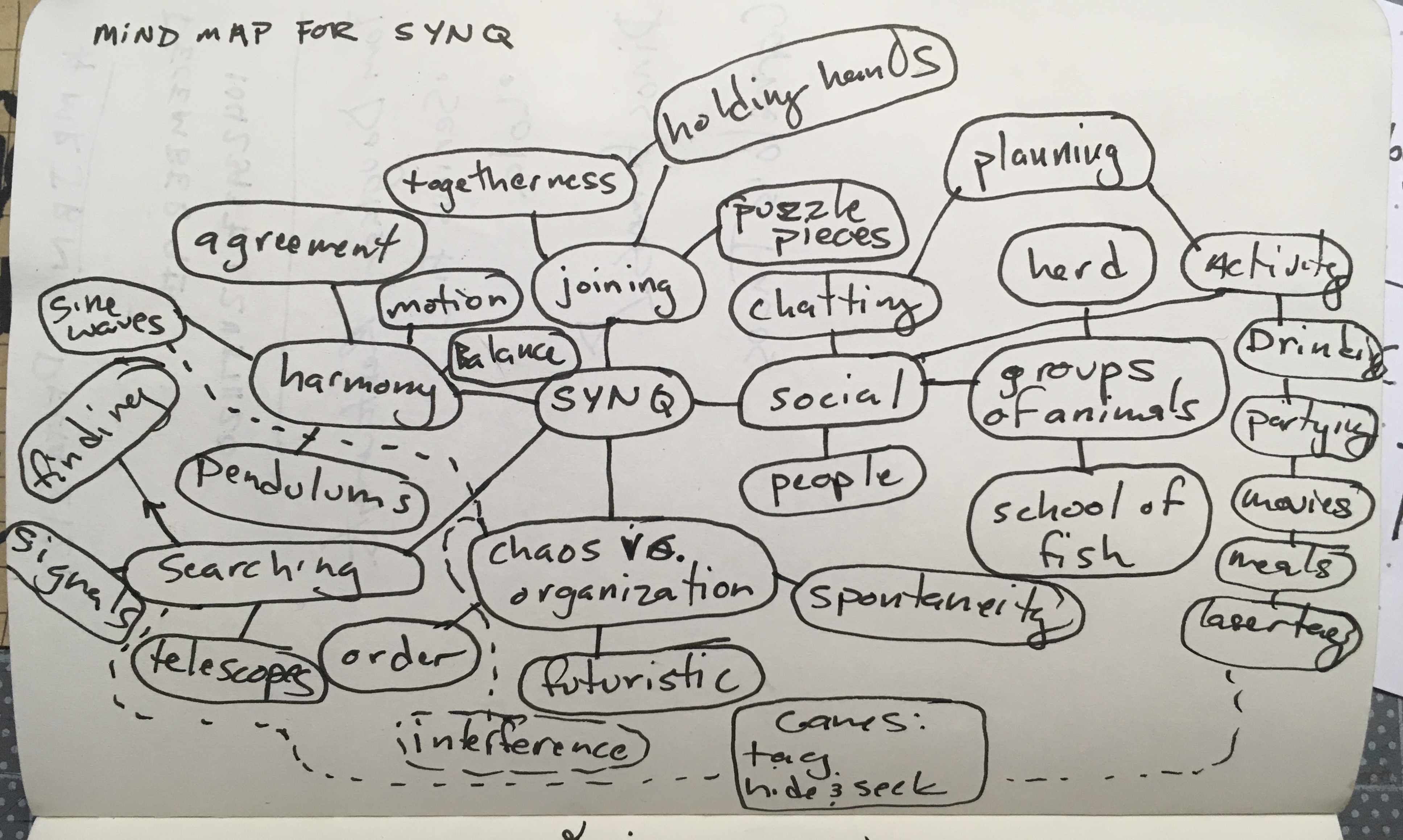
I started by sitting with the founder and brainstorming a quick mind-map, to generate seeds of inspiration. We started with the word "SYNQ" in the middle, and worked outwards listing connected concepts.
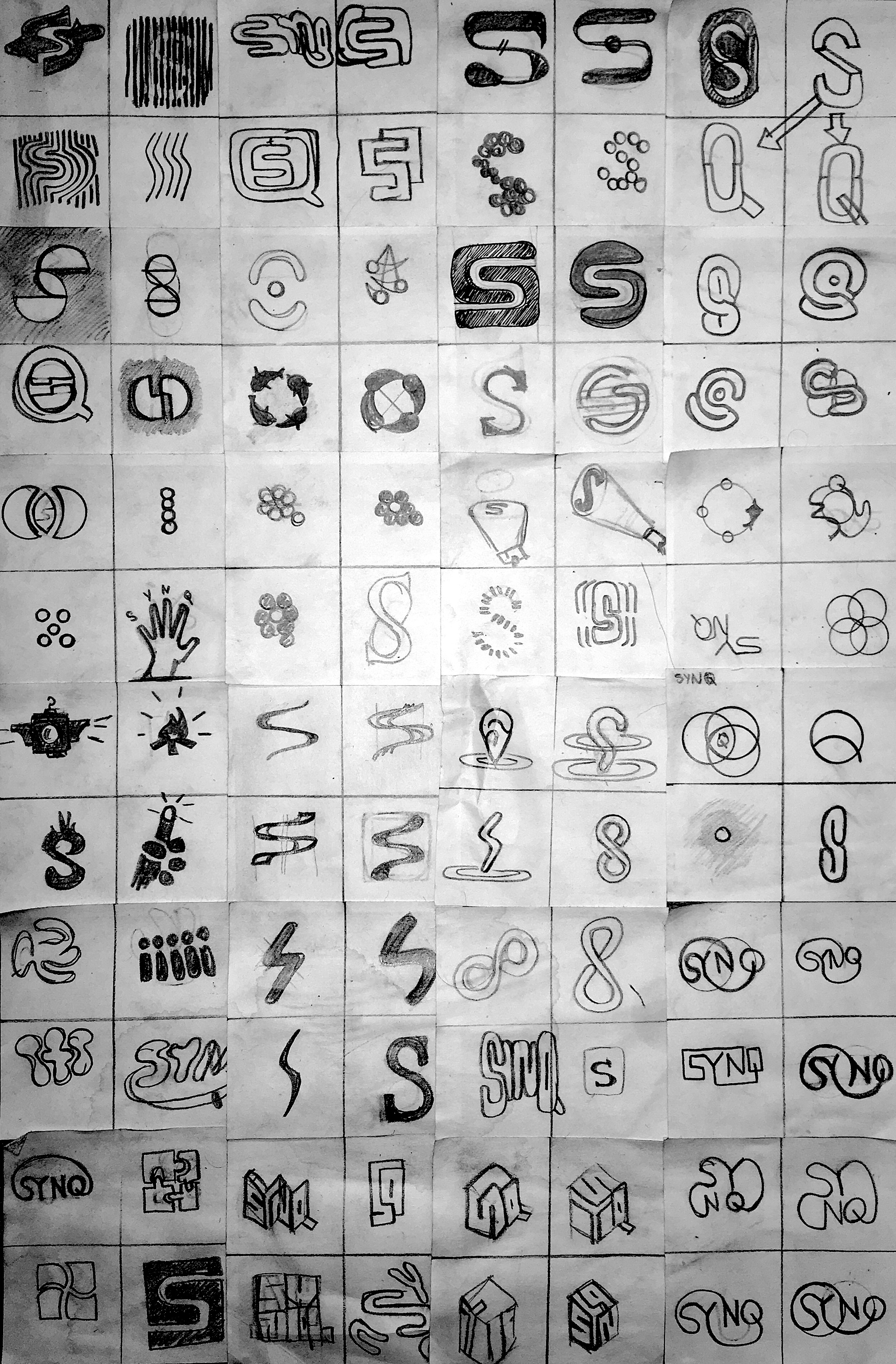
Next, with the concepts from the previous exercise loosly held in mind, I began a series of drawings, 4 per stickynote, with the aim of generating as many logo concepts as quickly as possible. I would work until I got tired of drawing, for 20 minutes at a time, taking a break in between to refresh my mind. Shortly, I had 96 iterations, and turned them back over to the founders to see which concepts and vibes inspired them.
With the team's feedback in mind, I moved to a second round of iteration, this time using Adobe Illustrator to flesh out some of their preferred sketches in higher fidelity.
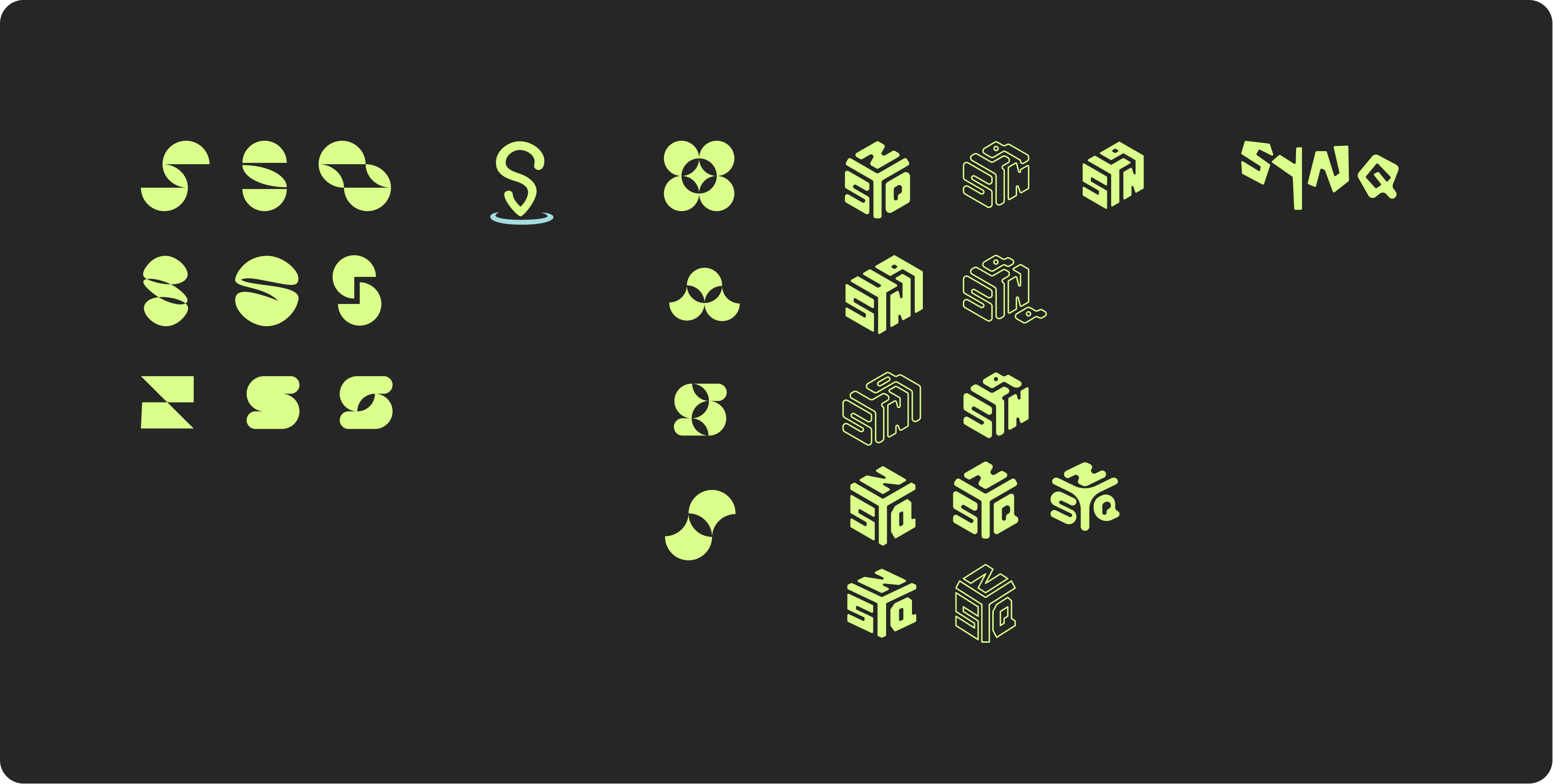
The teams favored the isometric designs, so I started to dive in and create more in-depth iterations to help drill into the perfect concept.
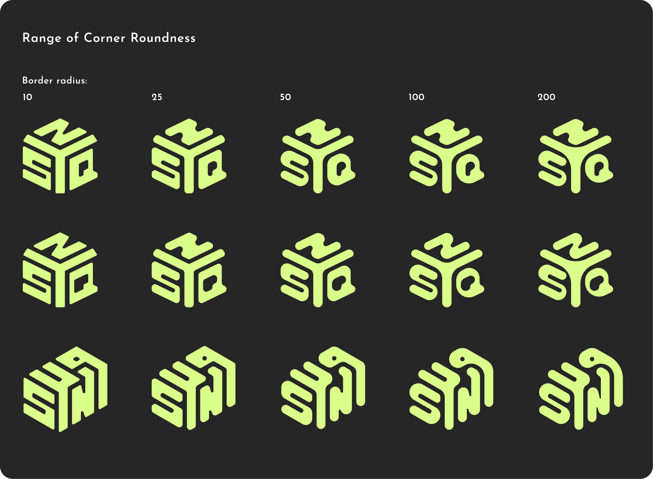
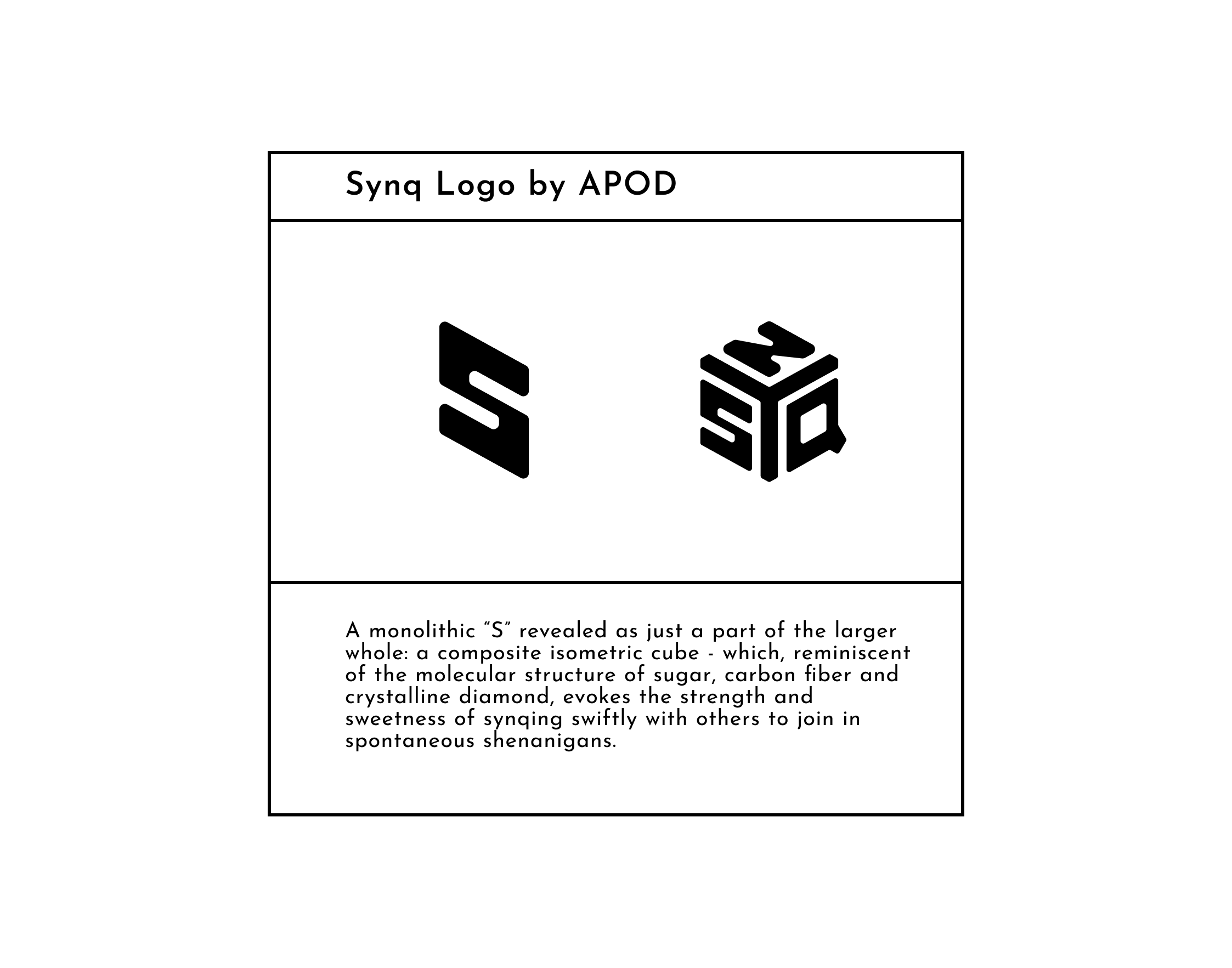
In the end, their favorite design was the cube-like isometric design, with fairly sharp corners. And we were confident in that, becuase we had tried out so much beforehand!
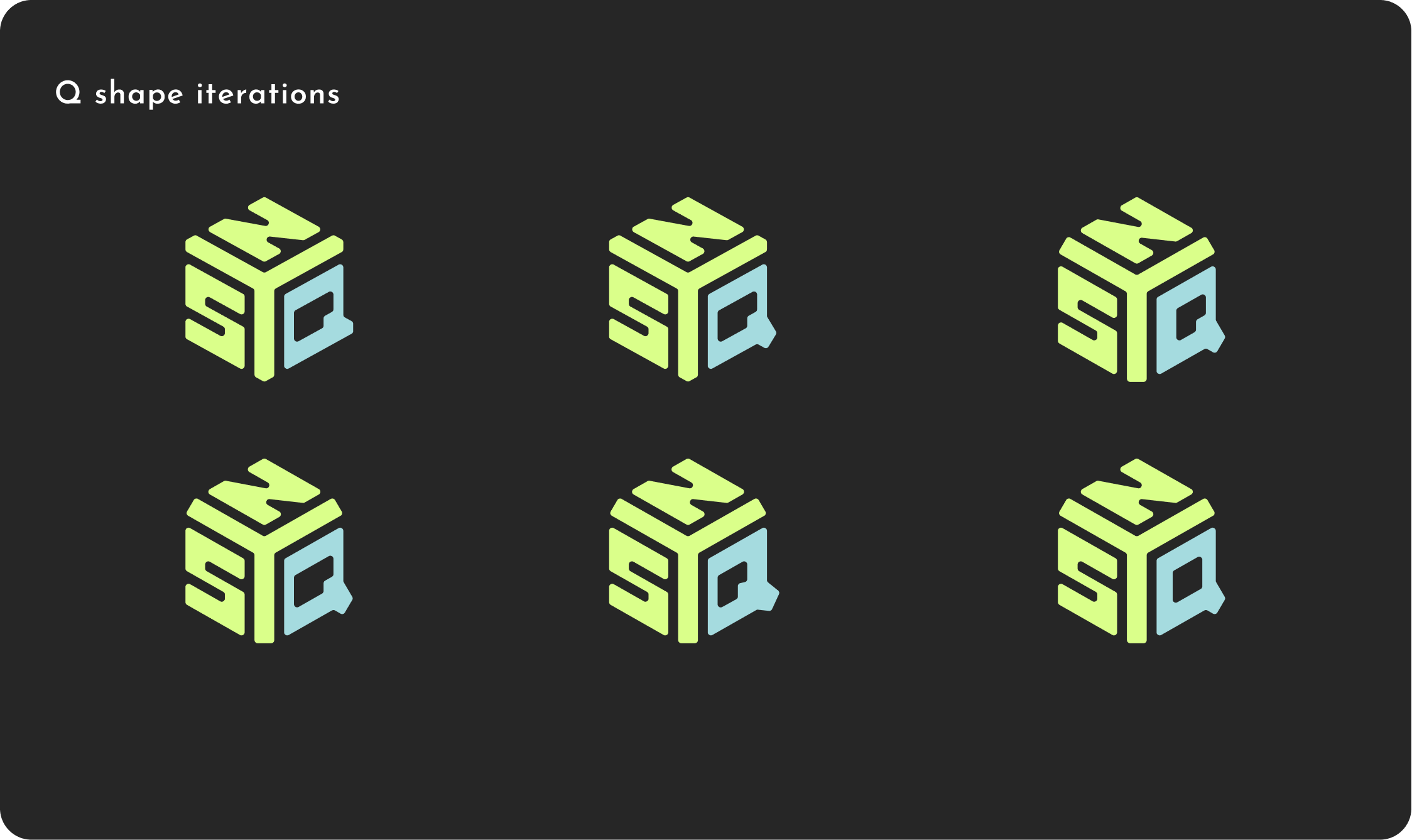
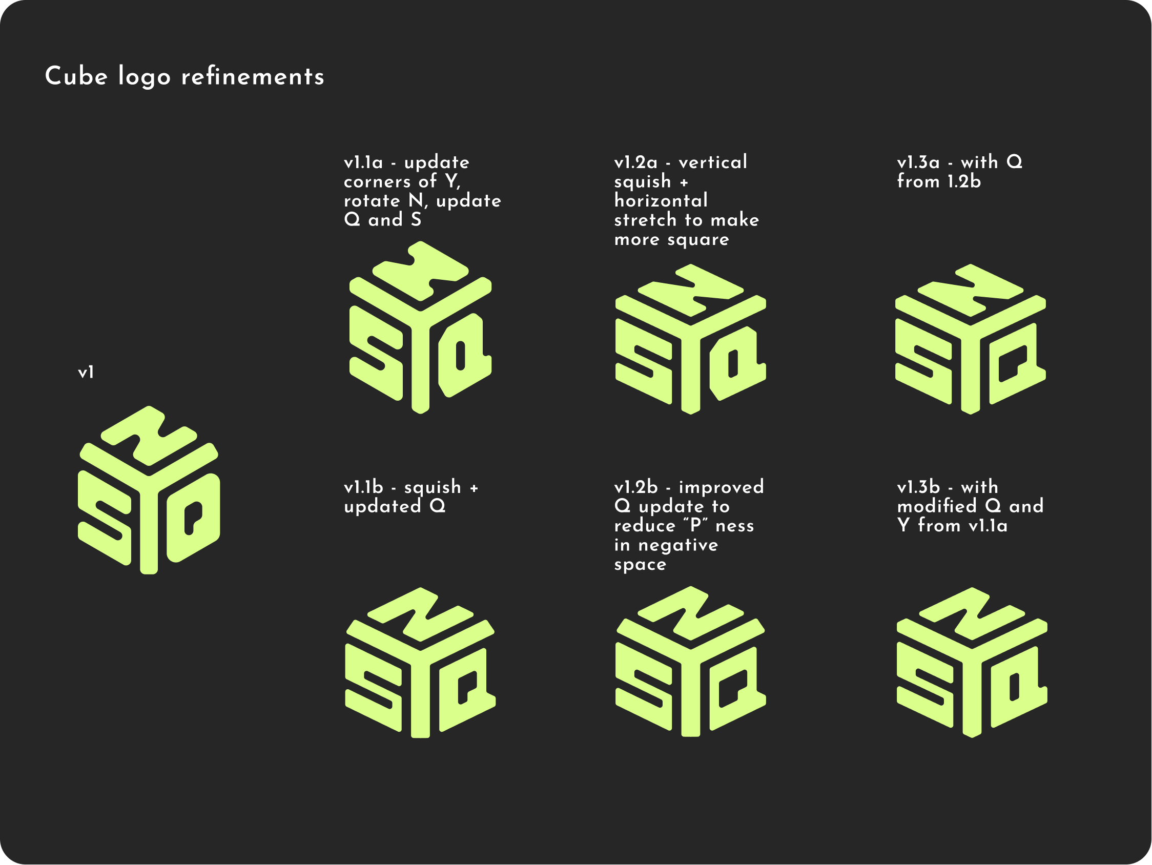
The next step was revising the logo concept to work out different kinks. When clients say something like "hmm, I wonder if the q could be better," I find it helpful to track my iterative steps to both present options and show the work that has gone into a final suggestion.
That's how we arrived at the finalized logo! This final SYNQ assembly also gave the option for using just the "S" or the full "SYNQ," allowing the founders both flexibility and consistency in their branding options.