App Design for ILOVEWHATEVER
Problem: The ILWE.io app is too complex for brand new users, lacks profile customization, and needs a design makeover facelift.
"How might we cut to the core of creative connection, allow users to create 'complete' portfolios in minutes, and make our app so simple that everyone can enjoy it?"
Solution: Adapt and Simplify our complex social portfolio app to create the foundation for a customizable and accessible creative networking tool with an updated look and feel.
Role: Design Lead, Product Lead, UI Designer
Impact: Lead efforts to re-imagine what ILWE's mobile experience with a new look and focus. Developed new, user-approved design system, outlined comprehensive profile customizability features, and created a new product roadmap in order to lay groundwork for further construction and growth as resources allow.
Link was conceived in the summer of 2022, after our term-sheet investor lost their LPs, and we lost our funding. Broke and burning personal reserves quickly, we had to refocus on getting proven results, user growth, and adjust our roadmap given our urgent resource constraints. Prior to funding collapse, we were already surveying our userbase monthly to track product market fit and identify key areas of improvement that would allow us to find product-market fit.
The biggest obstacles to adoption of our app, according to web users and artists and creators in our network:
1:1 follow-up interviews with survey respondents had indicated that we could address these issues with by redesigning the app's aesthetic, by improving our feed with filters and feedback options, and by iterating on the guardrails and supported uploads in the portfolio builder. With our NPS score hovering around 3 and a sizeable seed round term sheet signed and turned over to our investors lawyers, things were looking good for our plan to scale our small team, create a more compelling, useful experience for our users, and round out 2022 with organic growth and possible marketing.
Faced with the sudden reality of limited resources, however, we had to collect ourselves and pivot. What can we do right now to improve on accessiblity and drive more engagement? Through better education on how to use its complex features? Through the addition of simple social reactions to our content feed? Though both goood options in their own rite, we decided on more a more radical rework of the app, which lead to the removal of complex, confusing, and not yet useful features to refocus on the basics of creative connection.
The most incisive question we asked ourselves was: if we could go back to Nov 2019, knowing what we know now, what would we build? Throughout ILOVEWHATEVER's journey, our mission has been to foster genuine connections betweeen up and coming artists. For a long time, we thought that the best way to do this was through improving the portfolio experience, having artists upload their work, and tracking mutual collaboration. But consistently through our interviewing, it became more and more clear that for most artists and creatives, our current portfolio experience was just not working. A large part of this is that we did not have the resources to support direct upload of audio or video files. So, without the capacity or near-term prospect of supporting hi-fidelity portfolio uploads, it would have been much simpler to just ask people "who are your trusted creative peers?" and focus on networking. But it took a long time and lots of iteration for key stakeholders to accept that simple declarative connection, without was a valid indicator of genuine creative connection. Relaxing that constraint gave us a lot of freedom to rethink the tangled information web we had woven. Becuase those we interviewed responed well to our mission of fostering creative connection accross the board, and only some users were engaging with the portfolio building aspects of ILWE, we felt that simplification of the app and a refocus on networking was the best way forward.
We arrived at three core features of an app geared towards creative connection:
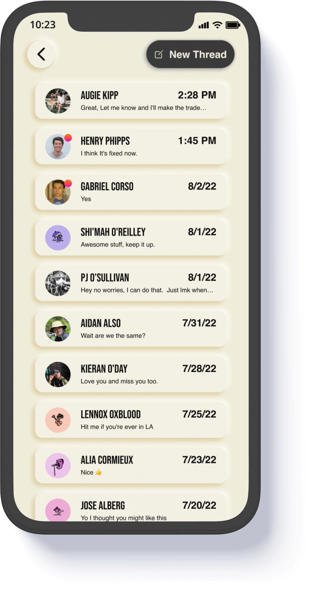
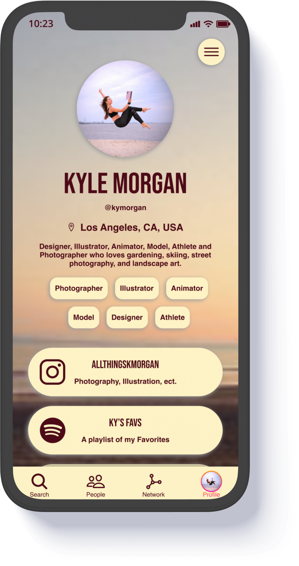
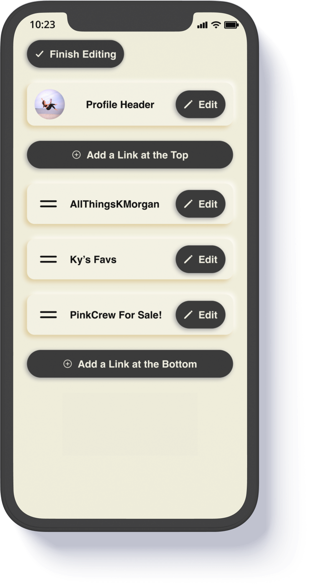
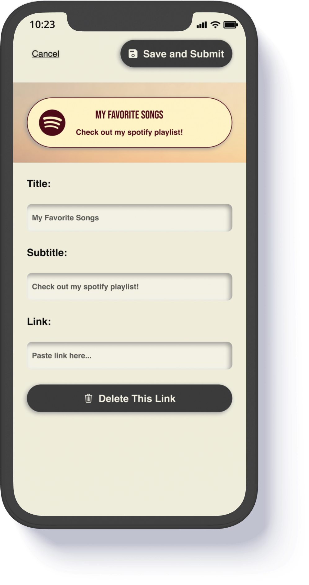
The new app is simple, elegant and focused on creative connection. It consistes of the Search Page, the Connections Hub with an integrated messenger, the Network Graph Explorer, and a Customizeable Profile:
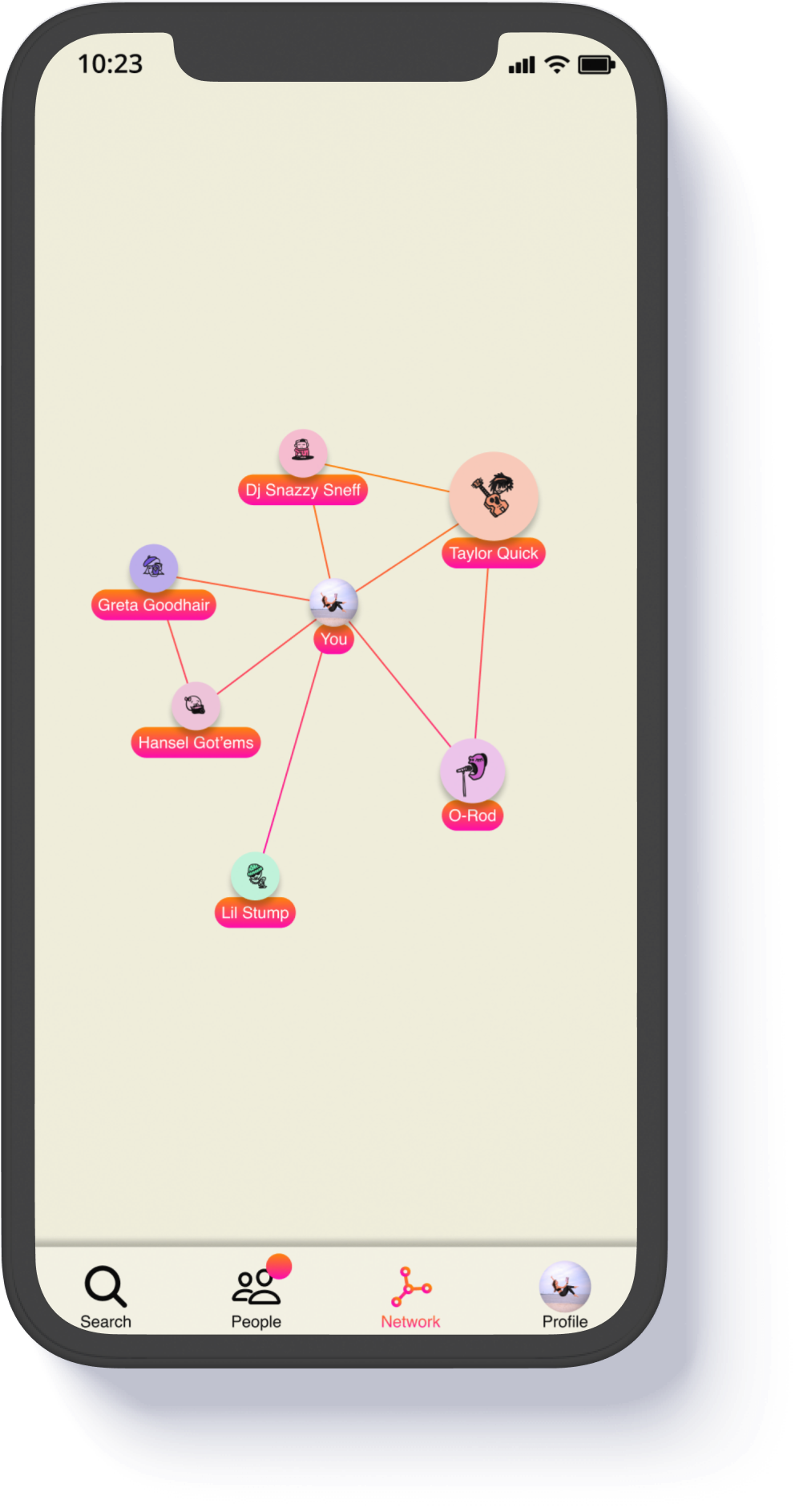
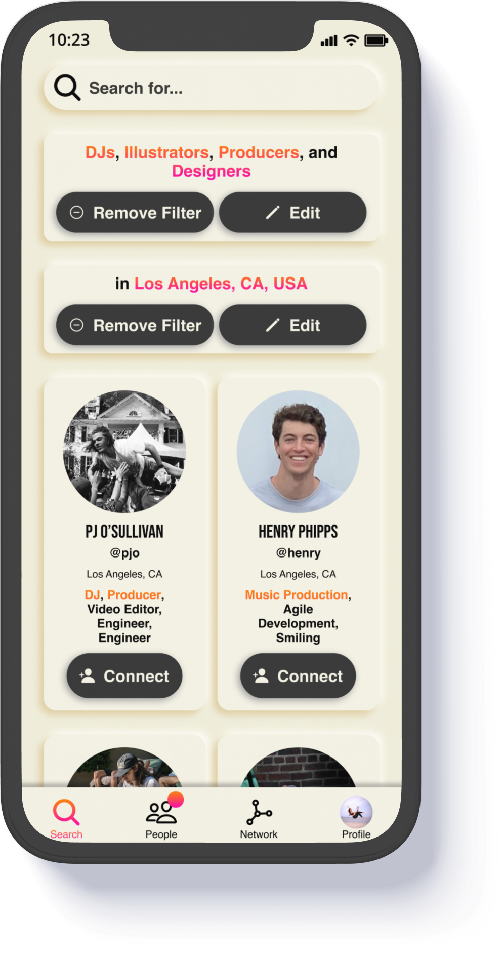
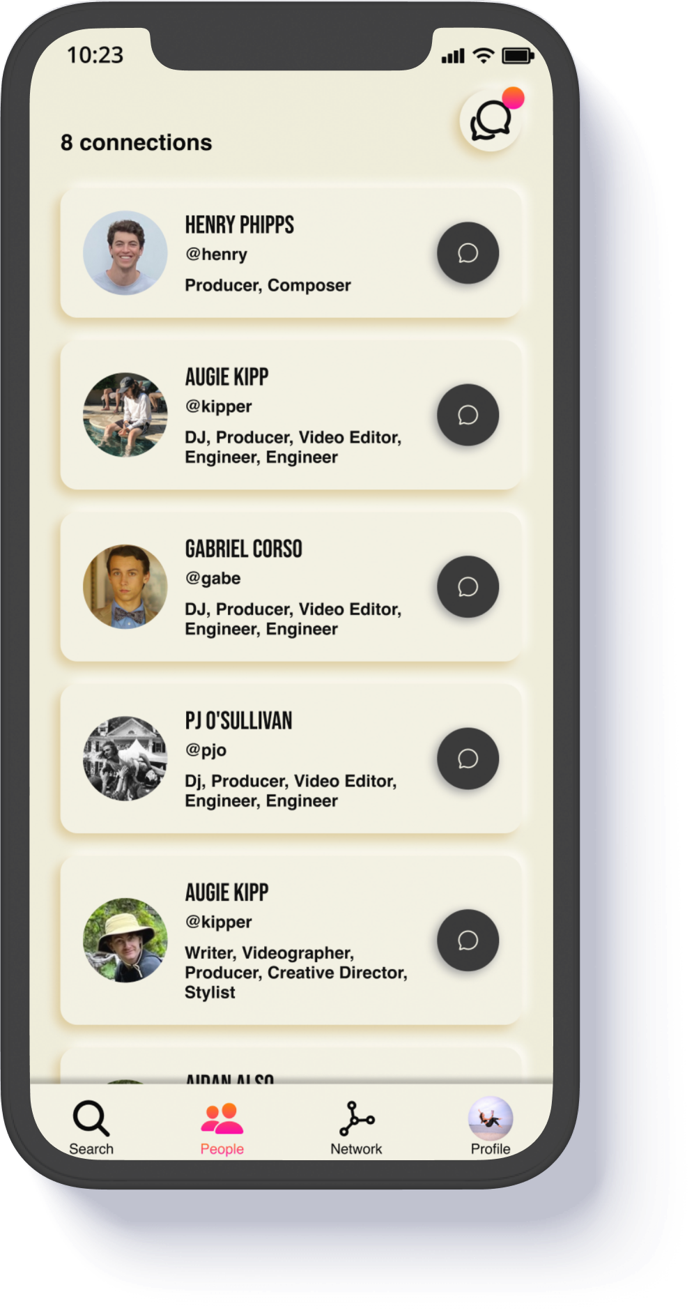
Even despite our compressed timeline, we were able to build and release the Link: Creative Connections MVP in September. It felt amazing to come together in the grips of existential crises and put together a beautiful, cohesive, and refocused design, and to release a great foundation for improvements. The design provides for the following improvements, should anyone wish to pick up on our progress and continue with next steps:
We were not able to achieve the viral, explosive growth that we needed to continue with focus on this project. In the first week after release, we saw 117 new accounts, attributable to a small backyard concert we threw to support launch. As of Nov 4th, we've seen accounts continue to trickle in absent any promotion, and a handful of user sessions every week. Maybe it will catch on and grow. Without resources to put behind improvement, promotion and release, spontaneous organic growth is not expected.
As of May 2023, we were not able to promote the application, and spontaneous organic growth did not occur. We have since taken the app down and dissolved our company. In other words, our 3 years of efforts did not 'work.' Was our project doomed from the start? I don't think so. Just the fact that we brought this company to life and kept it alive for 3 years is itself a feat. The fact that we attracted any regular users at all is a feat in itself.
If I could do it all over again, I have no doubt that we would do better. Looking back, I think our biggest mistake was designing the right thing for the wrong user for too long.
What do I mean? When we started ILWE in 2019, we used over 40 initial interviews with our creative network to develop 3 user personas- Newt, Mike, and Alex. They each represented a creative in one of 3 stages of creative development.
Newt is a new musician with no 'released' work, a creative hatchling who was often isolated, with a limited network, who was eager for connection. A newcomer to the scene, they would have limited offerings to an initially 'professional' network, we thought.
Mike is a hobbyist with a passion for creation and some released work. Mike wants to find peers who are at the same level as he is, and possibly a mentor or two.
Alex is a creative professional with lots of released work, and is someone who wants to connect with other serious professionals. Alex might also be willing to mentor Mike.
When we finished our concept sprint, we decided to try to build a platform for the interdisciplinary Mikes and Alexs of the world. On a longer timeframe and with a bigger team, we may have been able to acheive a scalable product for them- but as history shows, at every juncture, user feedback pointed to a simpler product that would work well for users who had released no work, or only wanted to highlight a few pieces of content. If I could go back and do it all again, I would start with the simplest interactions - in this case friending and profile building - and try to make those tools as strong as possible, hopefully getting something simple that is immediately helpful that scales quickly, and then build more functionality in as we grow.